Political Stances: Clustering Partisian Climate Data
Clustering is a text mining method which uses the frequencies within a document to assign meaning. To answer the overarching question of ideological differences divided among party lines clustering methods will be used to both identify differences or subsequent similaries from the differences in the available data. Methods used in this exploration are K-Means Clustering (completed in Python), hclust informed by Cosine Similarity for hierarchical clustering (completed in R), and Principal Component Analysis for 3-D spatial representation (completed in Python). This combination of methods are applied to provide a holistic understanding of the data provided in addition to different embedding measures to interpret the data differently.
To answer the research questions, the data will be clustered separately. One model will be used to inform the differences in partisian conceptializations of climate policy and the next will be used to inform the differences in media coverage about contentious partisian differences. In this analysis, the Party Platform will not be clustered because there are only two items in that dataset.
Clustering is used in this analysis to illustrate different atterns within the data. For example, clustering may show differences in topic or opinion from the media. To better understand how media coverage differs, clustering may illuminate different language used to discuss climate change. Clustering allows something similar to occur for the climate bills. It can demonstrate the largest or most important topics to climate policy across time. Without using clustering methods, this sort of analysis would otherwise be completed by hand. It can be expected that the media would center clusters around political figures or particular events, like the Los Angeles Wildfires. For climate bills, it may be expected to know more about particular concerns about climate change, like chemical regulations or energy shifts.
Table of Contents
- Method: K-Means
- Cluster Optimization
- Method: H-Clust
- Method: PCA
- Findigns
- K-Means Findings
- HClust and Cosine Similarity Findings
- Components of Climate News and Proposed Climate Bills
- Conclusions
Method: K-Means
To cluster any form of natural language data, the documents must be vectorized. Doing so allows for the computer to ‘read’ the language, but instead of with eyes it is computation. Document-Term Matrices were created for each data form. The first, is of Climate Bill data. This was collected from the United States Library of Congress and contains all bills with the topic of ‘climate’ that was introduced in either chamber. The total vocabulary after removing for stop words, numerical characters, and labels was over 10,000 different words. This data was collected using XML web scraping and the API provided by the Library of Congress. Next, news headlines were collected about ‘climate change’ and then labeled in accordance with the Partisan party mentioned in the news headline. This includes the news headline descriptions, but not the entire article. This data was collected using the NewsData API. Finally, each party platform for the 2024 United States Election was utilized. To read more about the data collection process, reference Data Collection The code for K-Means may be found at my GitHub Repository, it is not stored on my website because the file is too large! My apologies.
Data Preparation
Specifically for K-Means clustering, the data was normalized before by using TF-IDF. TF-IDF was developed by Luhn and Sparack Jones and is used for information retrieval [1, 2]. It informs what terms are uniquely relevant to providing meaning through the documents. This method calculates the term frequency and then the inverse document frequency. This provides a relative amount of how important the word is to the entire corpus and in relation to the document. For example, the word ‘climate’ can be assumed to be highly frequent across all documents, this term will be down weighted. This normalization process helps to situate the documents within a contextual space that is bounded in frequency.
Creating Document Term Matrices allow for the vectorization. Each document counts as a vector, and each row counts as an index in the vector. This allows for vector similarity to be calculated and to then cluster the data in the high dimensional space. K-Means clustering takes unlabeled data. This means that the words are clustered based on their vectors alone, not based on prior metadata. Using Lloyd’s Algorithm the vectors dimensionality is reduced to then be able to situate and cluster the indices in high dimensional space. Further dimensionality reduction is used conducted using t – Stochastic Neighbor Embedding, t-SNE, to the visualize the clusters in something we are familiar with: two dimensions.
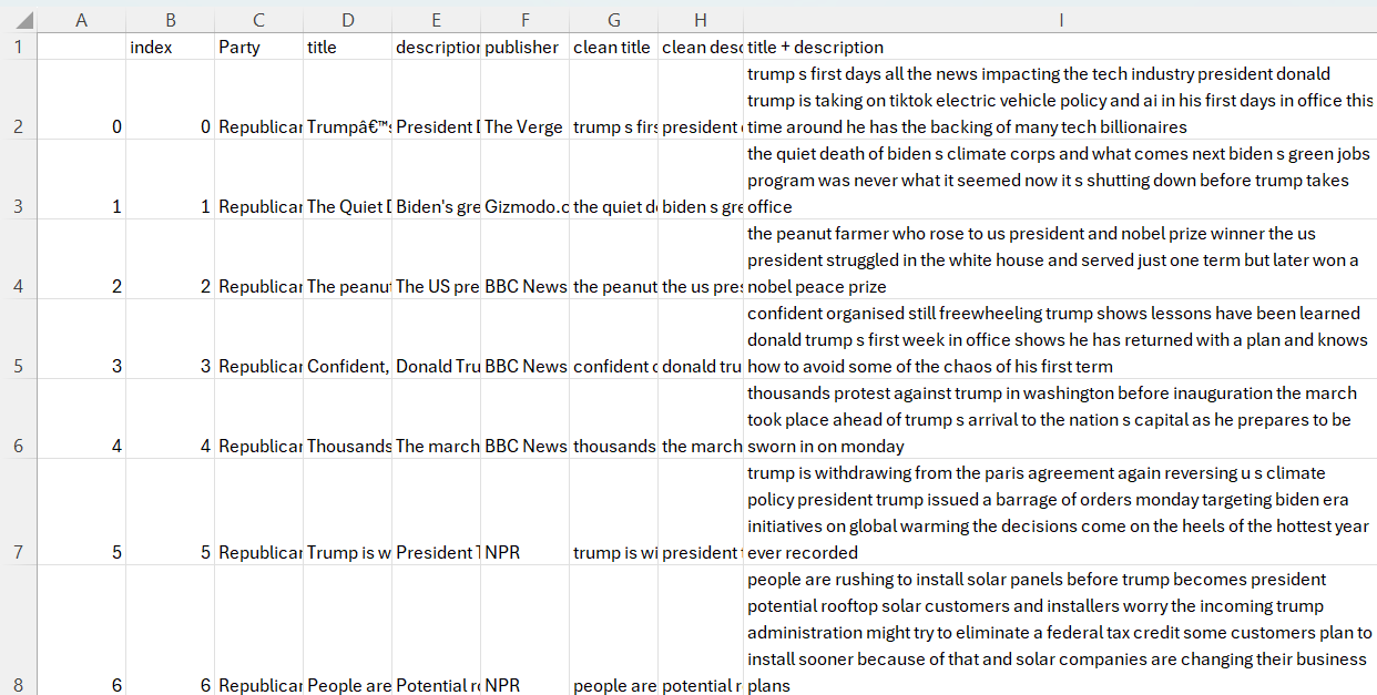
Raw News Data Example
This was the raw data from news sources. It was processed using Lemming and TF-IDF, as illustrated in the News Data TF-IDF example.
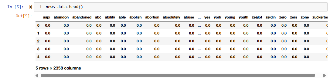
News Data TF-IDF Example
The Lemmed and TF-IDF version of the data was utilized in order to bound the frequency. Lemmatized data was then used to combine multiple word senses.
The data is available at this Hugging Face repository
Generating K-Means Clusters
To generate the clusters the Python library Sci-Kit Learn was utilized. The parameters afforded through the library are the number of iterations, number of clusters, and random state. The same random state was used across the model to set the model in a similar ‘mode’ when it is clustering the visualizations. Other than setting a defined seed, the random state does not have much of an effect on how the clusters are generated or represented in two-dimensional space. For all tests and modeling the random state of 811 was selected. No particular reason, I just thought it would be a nice number.
K-Means Cluster Optimization
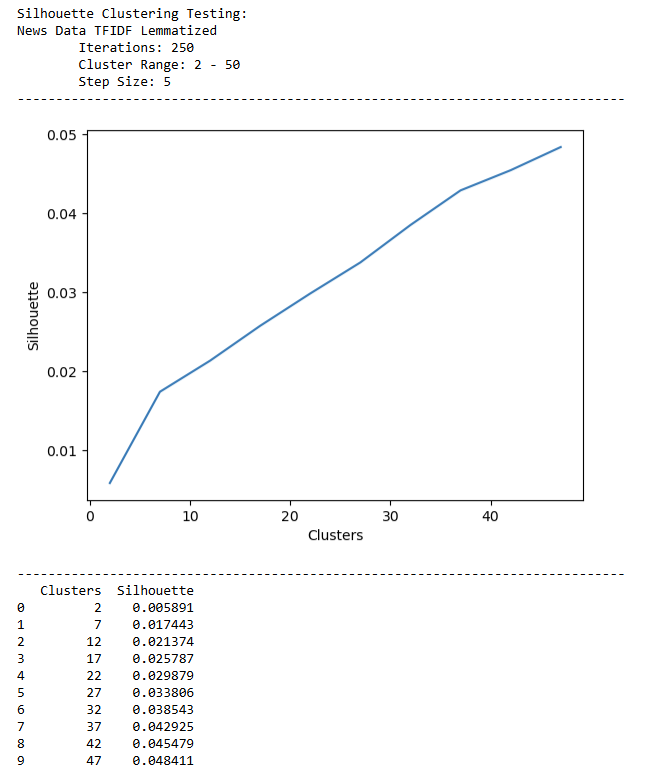
To identify the most appropriate clusters for the data, a recursive algorithim was created to test clustering methods at different step sizes. The purpose of this function was to systematically identify the best fitting cluster for each dataset on the same random seed and parameters.
'''SILHOUETTE CLUSTERING'''
## Defining the function to take the data to cluster, a consistent random state to use across testing, the desired number of clusters, and the number of iterations
def shadow_reporter(data,random_state,num_clusters,num_iterations):

    ## Instantiating the Model with the desired parameters
    km = KMeans()
    km.set_params(random_state=random_state)
    km.set_params(n_clusters = num_clusters)
    km.set_params(n_init = num_iterations)
    ## Fitting the data
    km.fit(data)
    ## Assessing the model for each iteration on performance metrics.
    shadow = metrics.silhouette_score(data, km.labels_,sample_size = len(data))
    return (shadow)


''' SHADOW TESTER '''

## This function takes a range and applies the Shadow Reporter based on the current parameters for the iteration.
def shadow_tester(data_name,data,random_state,num_iterations, step_size,cluster_start,cluster_end):
    shadow_scores = []

    ## Iterating through the parameters with a certain step size
    for clust in tqdm(range(cluster_start,cluster_end,step_size),desc='🧺🐜... clustering',leave=True):
        clust_score = shadow_reporter(data,random_state,clust,num_iterations)
        shadow_scores.append({'Clusters':clust,"Silhouette":clust_score})
    title = f"Silhouette Clustering Testing:\n{data_name}\n\tIterations: {num_iterations}\n\tCluster Range: {cluster_start} - {cluster_end}\n\tStep Size: {step_size}"
    df = pd.DataFrame(shadow_scores)
    plot = sb.lineplot(data=df,x='Clusters',y='Silhouette')

    ## Printing the output to judge best clustering fit.
    print (title)
    print ("-------------------------------------------------------------------------------")
    plt.show()
    print ("-------------------------------------------------------------------------------")
    print (df)
    return (shadow_scores)
This function was applied to each type of data, the News Corpus, the Climate Bills, and the Party Platform. Systematically testing the number of clusters with the best fit will generate more accurate models. Reported below are the parameters set for each model. As noted previously, the random state instantiates a shared vector, so the results may be replicated if so desired.
| Data Source | Number of Clusters | Number of Iterations | Silhouette Score |
|---|---|---|---|
| News Corpus | 4 | 1,000 | 0.011 |
| News Corpus | 20 | 1,000 | 0.027 |
| Climate Policy | 100 | 0.24 |
Method: H-Clust
The code used to complete the H-Clust analysis may be found at this page, or downloaded at my GitHub Repository
To preform HClust, or hierarchical clustering, R is utilized. The data used for HClust is a Document Term Matrix (DTM). An image of the data may be found in the News Data TF-IDF example earlier on the page. A DTM is utilized here because it uses the frequencies of words in a single document to identify potential clusters. Each row then becomes a vector in the dataset. The data is then normalized and transposed in order to meaningfully bound the data.
## Normalizing the Data
dtm_normalized <- as.matrix(dtm_data)

dtm_normalized <- apply(dtm_normalized,1,function(i) round(i/sum(i),3))
## And transposing to return to a DTM
dtm_normalized <- t(dtm_normalized)
With the normalized data, the cosine distnace was then calculated for the entire matrix. Due to the size of this dataset, the compute time was lengthy. Cosine distance is utilized to identify how related the vectors are, so instead of similarity, which is commonly discussed in NLP, cosine distance is calculating the difference in documents.
cosine_distance <- dist(dtm_normalized,method='cosine')
As noted earlier, the size of the data was a barrier to computation. For this reason, after calculating the cosine distance, the most 2,500 similar vectors were utilized in further clustering. The labels were then sorted as well to reassign them appropriatlely to the small portion of sorted data.
Finally, to cluster the data the method hclust was utilized. Ward Linkage method analyzes the variance in the clusters. This method was selected because we already know that the vectors selected are similar, but how varied are they?
cosine_hclusters <- hclust(smaller_data_dist, method = "ward.D")
cosine_hclusters$labels <- labels
Method: Principle Compontent Analysis
Similarly to K-Means the code for PCA is stored at the tail end of the notebook stored at my GitHub Repository, it is not stored on my website because the file is too large! My apologies.
To complete PCA, a tester function was developed to identifyt the ‘elbow’ or the point where the EigenValues experience less of a decrease. The Eigenvalue is a metric that is used to represent the variance of each component. This concept is rooted in linear algebra and may be understood as a summary of the larger matrix. When PCA is used to reduce the dimension, it is the measured with the Eigenvalue.
def pca_tester(scaled_data, raw_data, components,title):
    ''' PCA FITTING '''
    ## Fitting the PCA Model to the number of components desired
    pca_model = PCA(n_components=components)
    result = pca_model.fit_transform(scaled_data)

    ## Extracting the Values to Identify Variance
    eigenvalues = pca_model.explained_variance_
    explained_variance_ratio = pca_model.explained_variance_ratio_
    cumulative_variance = np.cumsum(explained_variance_ratio)

    ## Creating and Index for the Numbers of Principle Components Generated
    component_indices = np.arange(1, components + 1)

    ## Fitting them to a dataframe to plot
    data = {
        'Component': component_indices,
        'Eigen Values': list(eigenvalues),
        'Explained Variance Ratio': list(explained_variance_ratio),
        'Cumulative Variance': list(cumulative_variance)
    }

    plotting_data = pd.DataFrame.from_dict(data)

    ## Identfiying the largest Eigen Value drop
    eigenvalue_diffs = np.diff(eigenvalues)
    max_drop_index = np.argmax(np.abs(eigenvalue_diffs))
    max_drop_component = component_indices[max_drop_index]
The code listed above preforms a few steps, first, it instantiates a PCA model with the number of components fed into the function during its recursive loop. Then, the scaled data is fit to the model and Eigenvalues, expained variarance ration, and cumulative variance is calculated.
The component indicies are stored alongside of the above values in a DataFrame. The largest variance is the calculated to identify the largest shift of the PCA cluster.
    ''' PLOTTING '''
    fig = make_subplots(rows=1, cols=2, subplot_titles=["Eigenvalues", "Variance"])

    ## Plotting EigenValues on the left hand side
    fig.add_trace(
        go.Scatter(x=plotting_data["Component"], y=plotting_data["Eigen Values"], mode="lines+markers", name="Eigenvalues"),
        row=1, col=1
    )

    ## Highlight the largest drop
    fig.add_trace(
        go.Scatter(
            x=[max_drop_component, max_drop_component + 1],
            y=[eigenvalues[max_drop_index], eigenvalues[max_drop_index + 1]],
            mode="markers+lines",
            marker=dict(color='red', size=10),
            name="Largest Drop"
        ),
        row=1, col=1
    )

    ## Plotting Variance on the right hand side
    fig.add_trace(
        go.Scatter(x=plotting_data["Component"], y=plotting_data["Explained Variance Ratio"], mode="lines+markers", name="Explained Variance Ratio"),
        row=1, col=2
    )

    fig.add_trace(
        go.Scatter(x=plotting_data["Component"], y=plotting_data["Cumulative Variance"], mode="lines+markers", name="Cumulative Variance"),
        row=1, col=2
    )

    ## Situating Plotting Labels
    fig.update_layout(title_text=title, showlegend=True, xaxis_title="Principal Component", yaxis_title="Values")

    fig.show()
Next, the figure is plotted. Two plots are instantiated with the left plot illustrating the change in EigenValue over the change in components. The right plot demonstrates the variance over increase in PCs. The title is set to the currecnt data that was fed into the function, thus it allows it to become more recursive.
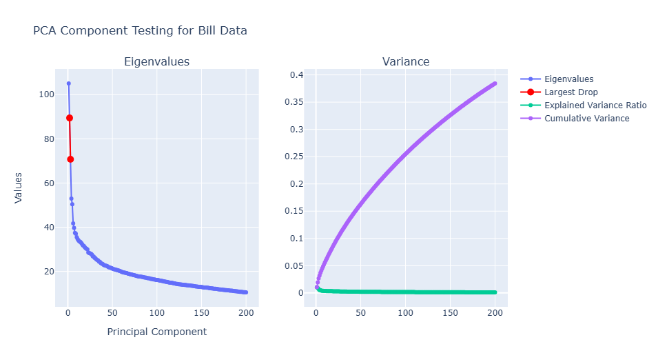
The figureabove illustrates the PCA Component Testing for Bill Data. The ‘elbow’ is around 50 principle components. The first elbow however, is arouhnd 15. Because the plot was rendered in Plotly Express, when ran in the notebook the EigenValue and principlce component are displayed on mouse hover. As expected, the Cumulative Variance increases as the number of clusters are increased. This is assumed because as the number of clusters increase the vector similarity will become smaller and moree specific for each cluster, thus, the variability will be increased.
Findings
K-Means: Topic Representations of Introduced Climate Bills and Media Concerns
K-Means represents the different clustering methods using the Euclidean distnance of the vectorized text. The more similar a document, it will be clustered closer together in the high dimensional space. First let’s address how climate change represented in climate policy introduced at the federal level. Using K-Means, it was illustrated the different trends or types of climate policy. The complexity and length of the documents resulted in a generous amount of topics. During optimization, the silhouette score continued to increase as the number of clusters increased - even into the upper 200s for k clusters. 100 clusters was selected to visualize because it is still detailed enough to obtain a silhouette score of 0.23, however, not too detailed in an attempt to preserve interpretability. A smaller K-Means clustering set of 20 was also established for the Climate Policy Data in order to compare a similar amount of clusters for the news data.
The distribution of the clusters may be observed in Figure: Distribution of Introduced Cliamte Policy Clustered Topics is fairly even, with the largest cluster being about the National Environmental Protection Act (NEPA) and wildfires. This would explain the far-reaching clustering demonstrated in Figure: Introduced Climate Policy: K-Means Clustering. As NEPA is an organization which has ties to multiple facets of climate change and other concerns.
Distribution of Introduced Cliamte Policy Clustered Topics
The largest cluster is in relation to NEPA, with over 900 bills fitting into this topic. Subsequently, the distribution of the clusters are normal, and there are a relatively even distribution amongst clusters. A few of the largest clusters are: (19) eligible, treatment, stormwater, wastewater, loans (2) climate, adopotion, global, coastal, resilience (8) permit, discharge, vessel, permitting, specification. Remaining clustes are primarily concerned with water, waste or pollution, and inequtiable impact.
Introduced Climate Policy: K-Means Clustering
As expected, the NEPA cluster is far reaching. It is not siloed within a particular topic such as water safety or ground pollution, thus it is similar to multiple aspects in the embedding space. Similar language used in climate bills about different topics may be identified. For example, cluster 5 is about species protection which is semantically closest to cluster 4 focusing on lake resotration. The cluster with terms about disapproval (13) is closet to NEPA and mercurcy terms.
Distribution of Climate News Clustered Topics
The largest clusters are concerned with the new Trump Adminsitration. Three out of the four largest clusters focused on Donald Trump. The only exception being a cluster concerned with the Los Angeles Wildfires, something which topped news charts for days. Climate topics are not as clear in this distribution of topics. Illustrated from this iteration of K-Means clustering is the decision to withdrawl from the Paris Cliamte Agreement, the L.A. Fires, and the hurricane in North Carolina. This illustrates that the media is more concerned with disastorous and largely consequential events instead of more passive changes in regards to climate change.
Climate News: K-Means Clustering
The largest clusters for climate news was (0) energy, renewable, buy, best, trump; (1) federal, state, government, plan, trump; (2) stronger, speech, stage, america, and biden. As proporsed in the introduction, the news clusters are particularly focused with certain actors, versus specific topics, as identified in Climate Policy
The distribution of the clusters may be observed in Figure: Distribution of Introduced Cliamte Policy Clustered Topics is fairly even, with the largest cluster being about the National Environmental Protection Act (NEPA) and wildfires. This would explain the far-reaching clustering demonstrated in Figure: Introduced Climate Policy: K-Means Clustering. As NEPA is an organization which has ties to multiple facets of climate change and other concerns.
In comparison to the introduced climate bills, the media coverage about climate change from a paritisan lens is less dense and topically interconnected. This can be inferred from Figure Climate News: K-Means Clustering. Unlike the NEPA cluster, there are not as many distincy forms of clutering between the topics. Interrelated topics may be identified when in reference to a particular entity like the transition between the Biden Administration and the Trump Administration (Clusters 18 and 4). The largest two clusters from the media dataset are focused on the incoming Trump Adminsitration (Clusters 6 and 9). Subsequently is a cluster about the Los Angeles Wildfires, which was extremly pertinent at the time of data collection. Spatially, this cluster is closest to Clusters 7 and 9, both of which are about Donald Trump and then a senate hearing. This suggests that there are not other media forms or current topics which were close to the magnitude of the L.A. fires. In the K-Means clustering of introduced climate bills, wildfires is not one of the 20 topics identified.
H-Clust and Cosine Similarity Findings:
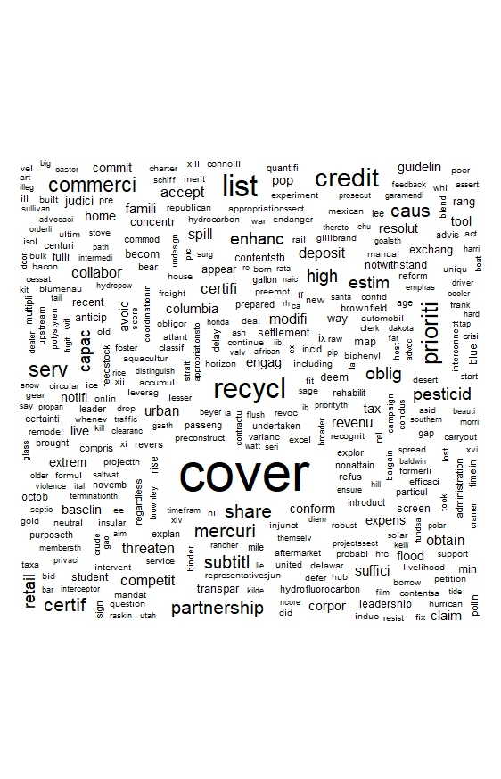
H-Clust illustrates a small portion of the documents. Only the first 500 most similar items in the corpora were included in the data provided to the *hclust* algorithm. First, it should be noted the word cloud developed from the normalized document term matrix. Recall that the data used was lemmatized, thus the words presented that are truncated are actually representative of multiple word endings. The words 'cover', 'recycl', 'credit', 'commerci' were notable large. It should be noted that many specific concerns, actions, and actors are represented in this wordcould.
The Radial Network uses the library NetworkX to help develop relationships between teh data using nodes. In this instance, the nodes are illustrative of differnt ‘branchings’ of similarity. In this case, because the data was paritioned the radial network may not be illustrative of the entire dataset. After closer analysis, the majority of the words illustrated in the network begin with the letter A.
This may be because of how the Cosine Distance metric calculates, and because the columns were alphabetical it may have granted a higher weight to that of the words which came first in the DTM. This is further illustrated in the differences from K-Means Clustering, and also the wordcloud generated from the normalized DTM in R.
Radial Network of Most Similar Words
A similar pattern is identified in the Dendrogram. A larger number of words was selected to be visualized, which is why the visualized words extend into the letter ‘c’. However, this demonstrates a different phenomenon of language - the situation of wordforms takes precendece over other forms of co-occurance in hclust. This suggests that using it in such a scope may not be the most efficient. It also suggests, that the words which may be nested hierarhcically are similar in their meaning.
For example, consider the hierarchical cluster with the words ‘administration’, ‘appeal’, ‘authorization’, ‘agencies’, ‘adjourn’ and ‘adjust’. While all of these words share the same first letter, they are hierachically positioned close to each other because they share meaning and significance in the legislative process more that that of ‘asbestos’, ‘baseline’, or ‘app’.
Dendrogram of Most Similar Words
The size and scope of the data used in this anaylsis is not appropriate for HClust. Illustrated here is a small parition of the data, and is not representative of the entire vector space.
Components of Climate News and Proposed Climate Bills:
Principle Component Analysis was conducted for the Climate Newsheadlines and the Proposed Climate Bills. The Party Platform is essentially already split into two clusters, and there are only two documents in the corpus, so PCA clustering does not illustrate nuance in the current form.
Listed below are a close consideration of a set of the Principle Components identified.
News Clusters:
Principle Component 6: coast: 0.1610 entire: 0.1610 salting: 0.1610
Principle Component 10: extend: 0.1654 battled: 0.1654 reconciling: 0.1654
Principle Component 16: tore: 0.1397 panicked: 0.1364 suburb: 0.1353
Proposed Climate Bills:
Principle Component 6: bisphenol: 0.0816 aldehyde: 0.0815 xylenol: 0.0815
Principle Component 7: bargain: 0.0869 preindustrialized: 0.0862 amounting: 0.0862
Principle Component 9: ephemeral: 0.0872 intermittent: 0.0760 continuously: 0.0752
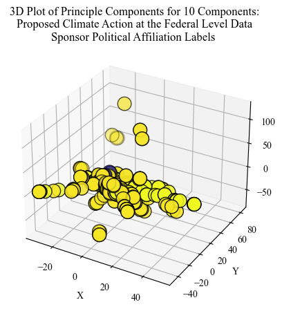
Proposed Bill PCA: Chemicals, Industrialization, and Time
Visualized for the Climate Bills was the partisian label of the primary sponsor of the bill. The majority is a single label, this suggests that the most relevant and continuous bills are proposed only by one party.
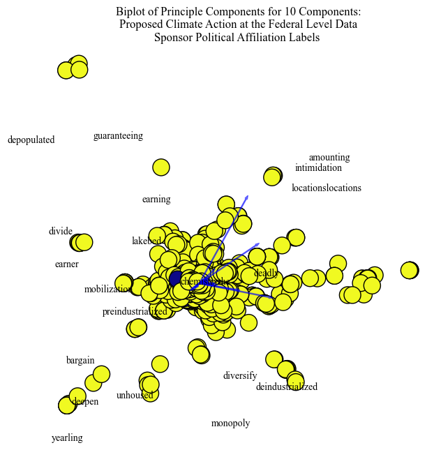
Proposed Bill PCA: Time and Industrialization
The words illustrative of time and industrialization are "intimidation", "chemical", "deadly", "divide", and "earning". These words show specific concerns for the portion of Priciple Components selected to visualize.
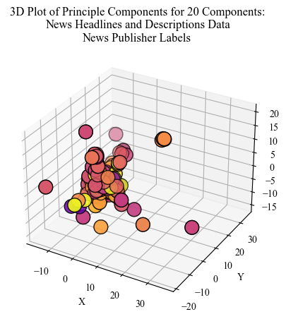
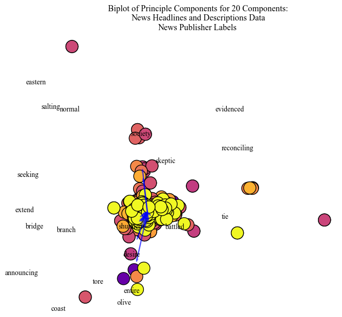
Climate News PCA: Oceans, Mitigation, and Concern
The legend for this visualization is the different News Publishers. This illustrates how differing publishers are grouped in semantic space.
Climate News PCA: Oceans and Mitigation
The words illustrative of oceans and mitigation use "bridge", "evidenced", "reconciling", and "skeptic". The publisher clustering differences are more clear here. There is a central 'node' of the articles, but one publisher is identified to be on the fringes of the PCA visualizations.
Illustrated with the labels, PCA helps to identify clusters between different groups. For example, the separation between Media Publishers becomes clear when coloring based on label. A discrepancy in partisan distribution was identified for a PCA visualization that was human labeled “chemicals”, “industralization”, and “time”. This suggests that either a particular political party only contributes to climate bills about this topic. However, while assumptions can be made about which political party in lieu of the literature, unless the labels were named, the assumptions would be unfounded.
Conclusions:
Using a variety of clustering methods, a closer look into topic and ideological lines were presented. First, let’s consider the climate policy corpora. K - Means provided insight into the re-occuring discussion about the Environmental Protection Agency, clean water, and also “climate adaptation” and “resilience”. The most prevalent topics were close to each other when visualized, however, as the EPA is important to many aspects of climate change, it was pervasive throughout the entire visualizaiton. Hierarchical clustering provided similar inisight with words about specifc climate actions and then specific climate concerns. Principle Component Analysis generated clusters that were still insightful into the content of the documents, but were not as clear as K-Means. The clusters selected for visualization were about chemicals, industrializaiton, and time. PCA identified some of the words characteristic of this cluster to be ‘chemical’, ‘deadly’, ‘earning’, and ‘divide’. When illustrating by label, one party was overwhelminingly present, however it is unclear which one.
Next, let’s consider news media. PCA illustrated a clear divide for some topics between media publishers. This supports prior understandings about partisian differences in news coverage. Furthermore, the topics generated using K-Means at this stage were actor oriented. The three out of the top four topics were about President Donald Trump. The other topic was about the disasterous wildfires in Los Angeles close to the time of data collection. Some other concerns in the K-Means clusters about climate change are off-shore drilling, hurricanes, and the United States withdrawl from the Paris climate agreement. Dissimilar to the EPA cluster in the proposed climate bills, the visualizaiton illustrates a more clear partitioning between the topics.
Using clustering techniques provided an insight into what was being talked about, who is the actor of concern, and how topics are situated within each other.
Bibliography:
[1] Luhn, H. P. “A Statistical Approach to Mechanized Encoding and Searching of Literary Information.” IBM Journal of Research and Development 1, no. 4 (October 1957): 309–17. https://doi.org/10.1147/rd.14.0309.
[2] Spärck Jones, Karen. “A Statistical Interpretation of Term Specificity and Its Application in Retrieval.” Journal of Documentation 60, no. 5 (January 1, 2004): 493–502. https://doi.org/10.1108/00220410410560573.